
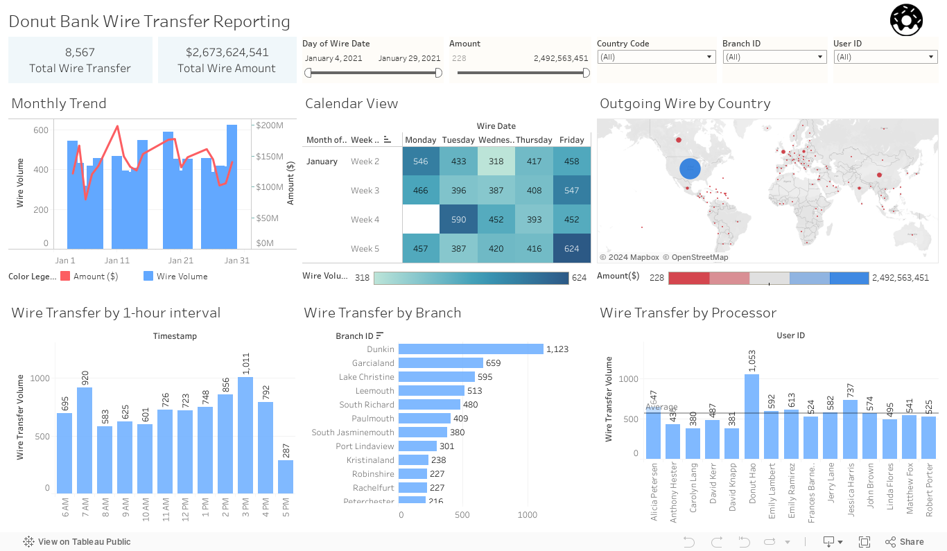
This is a reporting dashboard of outgoing wire transfers for Donut Bank, I used the Faker python package and other websites to create a large dummy dataset. I also applied business logic when I creating this dataset, including what the time of the day have the high volume of transfer, branches in urban areas (high population density) have higher volume & amount of wire transfer than rural areas(low population density), commercial areas usually have a higher amount of wire transfer than residential areas, etc. Those logics are the analysis results we got from different clients, I applied them to the dummy dataset to make the report make more sense and meaningful.
This dashboard not only reports on the wire transactions for the management team but also can provide them more insights. For instance, the “Wire Transfer by 1-hour interval” chart will tell the manager to try not to assign too many tasks to the team member during 7-8 AM, or 2 – 4 in the afternoon, which usually has a higher transaction volume comparing to other time.
Due to the layout setting of WordPress, which I can’t change, you have to scroll to the right a little bit to see the complete embedded dashboard below. you also can click the full-screen button at the bottom-right corner.
Note: Please click the ![]() button on the bottom right corner of the dashboard to enter the full-screen mode for a better experience.
button on the bottom right corner of the dashboard to enter the full-screen mode for a better experience.